ARTEXT : La Biennale di Venezia
56 Esposizione Internazionale d'Arte
Giardini di Castello - Danimarca
Danh Vo
"Mothertongue"
Marianne Torp interviews Danh Vo on his exhibition mothertongue The Danish Pavilion, April 2015.
Recently, you said, My work is very much about putting different layers of time
together, aspects, forms, ideas. It mutates I wanted to take a starting point which relates
to cultural production that derives from destruction, from warfare, from violence.
It's a big subject matter. For example, with film, I had an attachment to post-World
War II Italian films and Japanese films. I've tried to think about why that is, and it's possibly
because there is something beautiful about countries that have to build up from ground
zero. That's their condition, and amazing thinkers, amazing producers came out of this
situation. And that may also be why I was so attracted to many artists active during the
AIDS epidemic because they just had nothing to lose. And the proof is in the product.
That they were actually able to come through the situation with some really radical ideas?
Exactly. And it yielded amazing, amazing works. As an artist, I look into these things in
order to find a standard to live up to, in order to think about what it is we want culture to be.
Because I don't think that we live necessarily in a fantastic period of time without
problems. We wrap ourselves in all this happiness for me it is a problem that people
think they are so happy. Somebody has constructed that for them and that's brutal control.
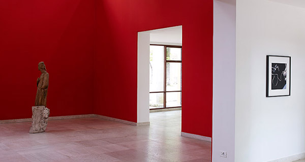
Architecture is often related to control, and addressing the Danish Pavilion's
architecture is an important element of your exhibition. How is it that you are using the
pavilion's particular architecture?
We decided to restore the pavilion back to the original architecture of Carl Brummer
(1930-32) and Peter Koch (1959-60). And the reason was actually very simple: we
discovered that the window frames are made of Burmese teak a material you can't use
any longer, and the skirting boards are made of limestone. But when I first saw the spaces,
everything had been painted white. These are just nice details, and they were all hidden
sometime after 1960 when the extension was inaugurated, in a period where you would
still have conflicting ideologies of how museums spaces should look. I'm not necessarily
so interested in white cubes, so when you get a space with all these other qualities, you
better make use of it.
Also several doorways and windows had been covered over the years. We reopened all of
them and then restored the original brickwork, which had been opened at some point to
create two new windows into the garden, which were not part of either original design. So
it's just taking the design back in order to see how you can work from it. But I should
emphasize, I am not particularly interested in restoration, as such; I wanted to restore the
spaces so that I could start reflecting on how to use them.
So did the restoration actually affect your thinking about the works that you produced
and included in the exhibition?
These early decisions are part of a process. It's not about a desire to tame the space
and put your work in there, it's the desire to create a space, then see how you work and
interact and create dialogues; it's more of a dance.
You also chose to take out all artificial lighting?
Yes, this is because the architecture was made without artificial light. So removing it
was part of a natural process to strip it back to the two coherent design logics. All the
spaces in the pavilion have access to natural light; both architects designed the pavilion to
be lit naturally. Back then, the biennale was only open during the summer. For, I suppose,
political and economic reasons, the biennale lasts almost seven months now. So, we
decided to close earlier as the days get shorter.
You have also been thinking a lot about placing the works in relation to the
architecture and you ended up placing very few works in the larger gallery spaces, and a
higher density of works in the adjoining, low-ceilinged spaces. How did that decision come
about?
It's actually an old trick. Because architecture is, of course, seducing you to use it in a
certain way and that is often a trap. It was important to me that the whole space feels
equal. If one space feels more important than another, because it is more grand or the
light is brighter or whatever, it is a trap to then place the most important work in it. I try to
avoid these traps. Through my mode of installation, I really try to make a statement about
how small spaces, corners, whatever can be equally important as these bigger spaces.
There are always ways out of these traps.
How does the red silk relate as it is the only significant change you made to the
space: I am referring to the fabric you produced and installed to cover the entire walls in
one of the larger spaces.
Yes, but that's a slightly different question, as the silk is a work installed in the space
itself, not a change to or comment on the design. When I place works in the pavilion, it's
about meaning, material, and decisions that are important to put in dialogue. I started to be
interested in colour as economy, colour as fashion, colour as ideology. And we know, of
course, that white is like red or any other colour; it is ubiquitous in these spaces for
ideological reasons. And that is no different from 500 years ago, when red was a
preferred colour or blue. To use colours as a material in this way is actually a new subject
matter for me.
The colour has this very specific reference point as well'it is a particular red colour,
is it not?
It is dyed with cochineal, to match a code for the colour worn by the cardinals in
Rome. As we are in Venice, I wanted to structure the exhibition around ideas concerning
all these travels: the discovery of America, discovery of space, trade with China... It's all
these itineraries that have connected in weird ways, often out of simple practicality. There
is just something beautiful about the material trail left by all these fallen empires. In a way,
the exhibition is a kind of travel through various time periods and cultures. This is an
important point when one is in a position of national representation: that's the moment
where you have to make a statement that culture is not native; culture is cross-pollination,
cross-contamination. It's not geography only, it's time, too. I think that we somehow
succeeded in getting this point across, even subtly, in this presentation. It goes from
exclusive cardinal red and the School of Pisano sculpture to Johnnie Walker. And that is
the beauty of it, that you can contain that in one show.
As well as your father, Phung Vo, who you involve often in your work. His labour is
especially evident in this exhibition?
Yes, I began making work with my father in 2009, with the desire to make use of his
calligraphy skills. My parents ran various coffee shops and restaurants in Copenhagen
when I was growing up. At one point, they took over a restaurant call The Shrimp that
had a big sign in the shape of a shrimp outside, so they renamed it. The China Shrimp
and served Chinese food. The place was never very busy so my father spent his spare
time engraving all the wine glasses with the name of the restaurant and its shrimp logo.
When my father was relocated from Vietnam to Denmark as a refugee in the late 1970s,
he never really learned Danish properly, let alone how to write in Danish. Writing was thus
something he rarely did. I saw his handwriting only occasionally while growing up, like
when he made these glasses and signs for these businesses.
You've produced work with your father for several years now, however, one thing I
have never seen in your work prior to this exhibition is classical Danish modernist furniture
by Finn Juhl, and there are two designs by him in the pavilion?
Yes and that is because I discovered Finn Juhl very recently. Great design often
operates a lot like great art, there are conceptual reflections and reasons behind it. Juhl
designed this bench to be used also as a pedestal for objects, so I thought why not use
that in the exhibition and see how it functions? For the Judas table, he used Brazilian
Rosewood and even silver. I think it was great to include the table because you get these
materials that carry a lot of meaning and then come together to make a table like that! I
think that table is a cultural product that can be compared to great artwork of Christian
iconography. Culturally, there is a division between design and art. But to make a Judas
table? That makes so much sense. It can accommodate 12 people. I mean there is a
certain perversity in it that of course attracts me.
Curatori : Katya Garcia-Anton
Commissioner: OCA - Office for Contemporary Art Norway.
Web site: http://www.danishpavilion.org/ |